Design with
System
Design with
System
Editorial Design for Kraemer Elektronik: Product Brochure
Task
Kraemer Elektronik is an expert for high-precision tablet testing systems used in research and industry.
With a cooperation partner, the Darmstadt company distributes several product lines. In order to present the products uniformly at trade fairs and in sales talks, a common communication package was still missing.
Solution
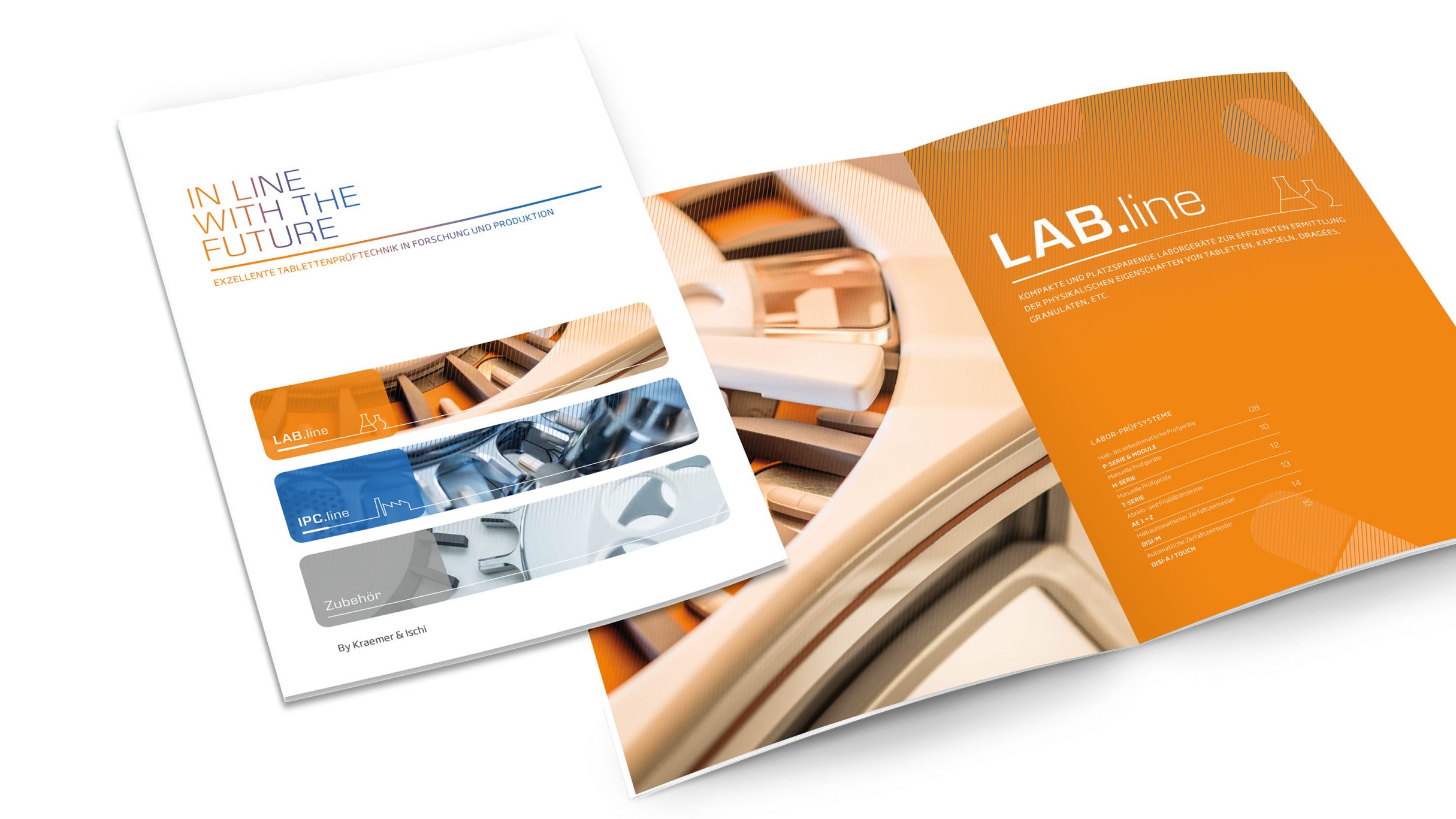
On the basis of the new corporate design, DIE NEUDENKER® developed a product brochure which will be used in sales and marketing from now on. The brochure offers an overview of tablet testing devices, services and accessories. The brochure was published in 5 languages (DE, EN, FR, ES, RU).
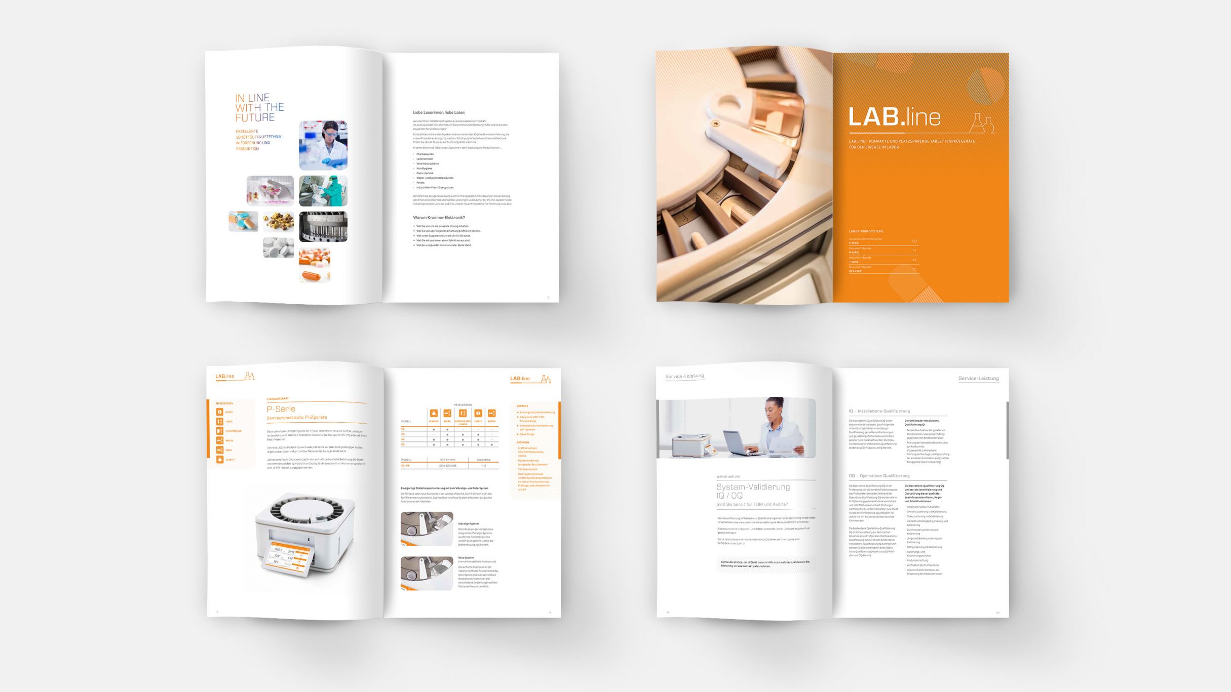
Editorial Design: Well structured and quick to grasp
In order to appeal to target groups from the pharmaceutical, food and hygiene industries, we deliberately designed the editorial design to be clean and bright, with plenty of white space.
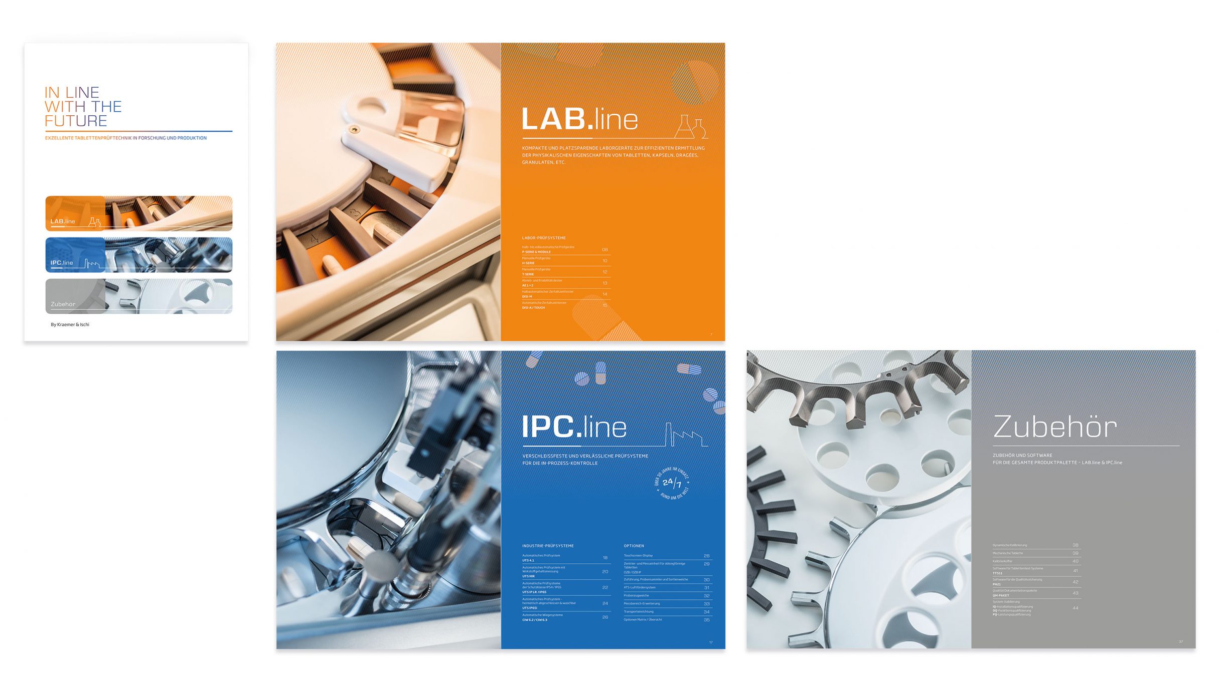
The product lines Lab.line (laboratory equipment), IPC-line (test systems for in-process control) and accessories are given their own colour code for better orientation. This colour code is consistently applied to icons, fonts, graphics and the chapter openers. We have added the colour violet to the colour code on the Kraemer website - it stands for Individual System Solutions.
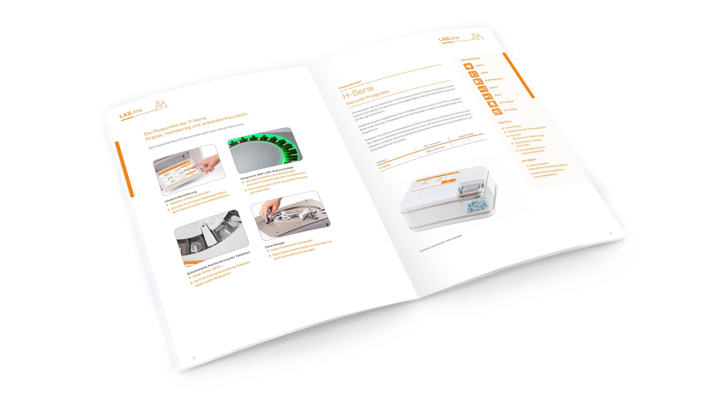
Special highlights are the double-page chapter openers in orange, blue and grey, according to the product lines. On the left, full-format photos, photographed in the appropriate coloured light, show typical details of the tablet test systems. This gives the technically sober devices an emotional effect. The carefully staged product photographs contribute significantly to a positive, high-quality brand perception.
On the right are reduced graphic illustrations of tablets, capsules and dragées together with a short list of the testing devices and their functions for an initial introduction to the topic.
In order to achieve a quick comprehension of the contents and a high degree of readability, it was a special challenge to reduce the large amount of existing knowledge, data and texts to the essentials and to create a fresh and timeless design.
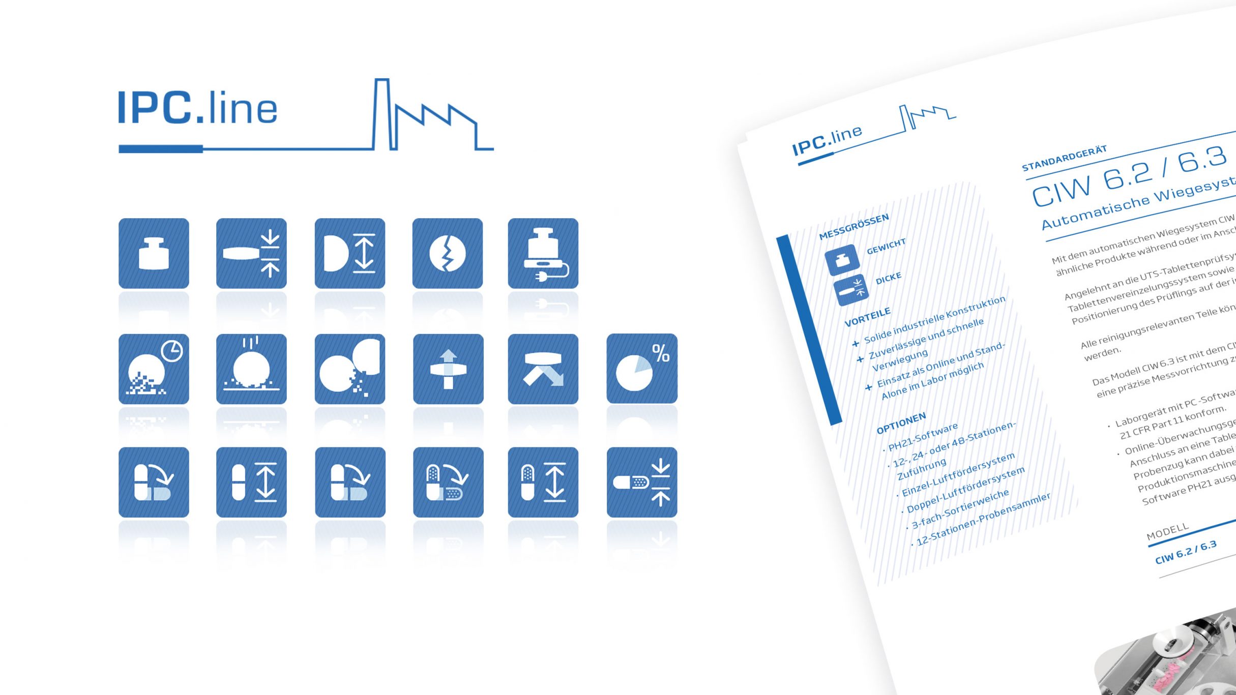
The inner sides follow a clear structure. A table in the margin provides concise key data, advantages and options for each product. Icons show the corresponding measurement parameters. So the reader can see at a glance whether the tablet testing device is suitable for his requirements. A short informative product description and device photos complete the whole. The viewer quickly understands this recurring structure and finds what he is looking for in a short time.
The contents were created in close cooperation with the clients and experts of Kraemer Elektronik.
Partial UV varnish on the cover gives the brochure a noble 'touch' - and leaves a shiny impression.
DIE NEUDENKER® Services
- Editorial Design
- Concept, Design Grid
- Corporate Colours & Corporate Fonts
- Graphic Design
- Individual Iconset
More Projects for Kraemer Elektronik
