Striking
and charming
Corporate Design
Striking
and charming
Corporate Design
Corporate Design for H2S architekten
With a great deal of sensitivity for design and functionality: this is how H2S architekten plan, realise and modernise the buildings of their clients all over the world. This way of working should also be reflected in the corporate identity of the company.
H2S commissioned DIE NEUDENKER® not only with the redesign of the website, but also with the redesign of the corporate design and the company logo.
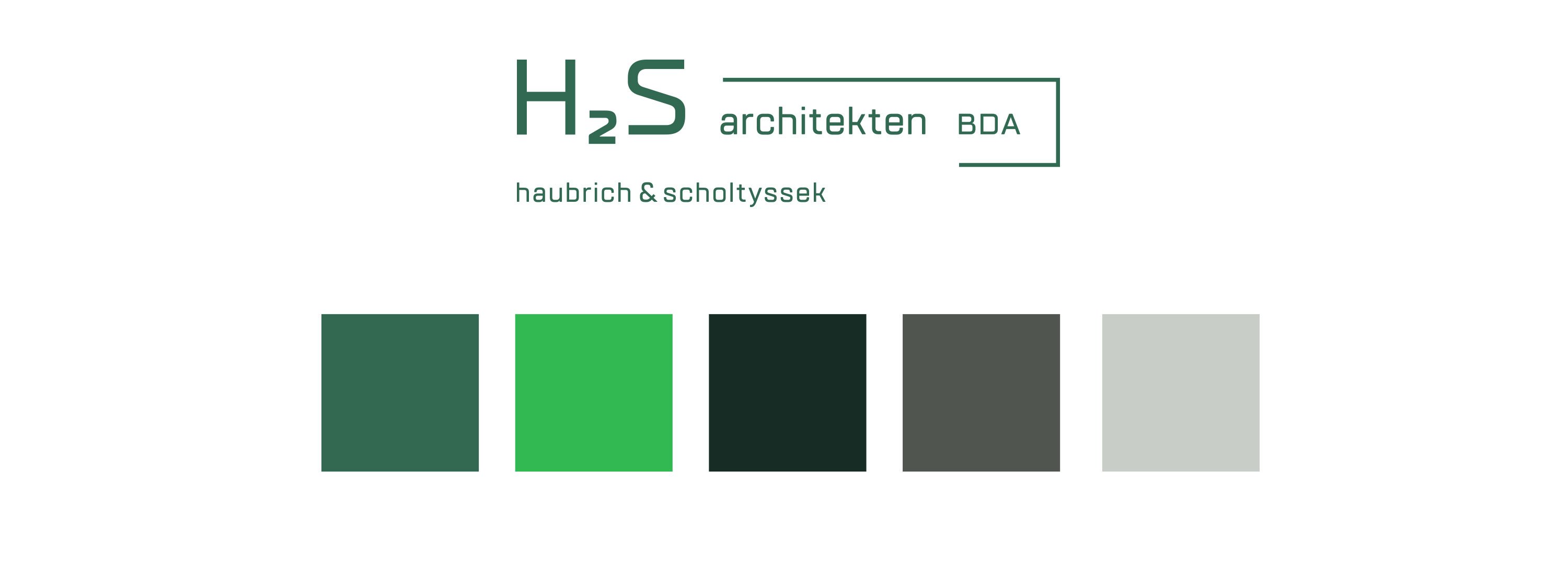
We have chosen the new font 'TT Lakes' for the simple but technically elegant lettering in the logo. The 'Helvetica Neue' remains the corporate typeface for continuous text - both in print and online.
The distinctive bracket completes the new H2S logo. It symbolizes an architectural overhang: an element that projects beyond its own base area. H2S thinks anew in every project and thus performs outstanding work in the planning and realisation of innovative buildings. The bracket gives the new logo a friendly and open character, in line with the H2S company philosophy. On the new corporate website, DIE NEUDENKER® have quoted the bracket of the logo as animated buttons.
It was the customer's wish to keep the cool green as the corporate colour. THE NEUDENKER® extended the H2S color palette around a fresh green for highlighting in texts, a dark black-green and two gray shades.
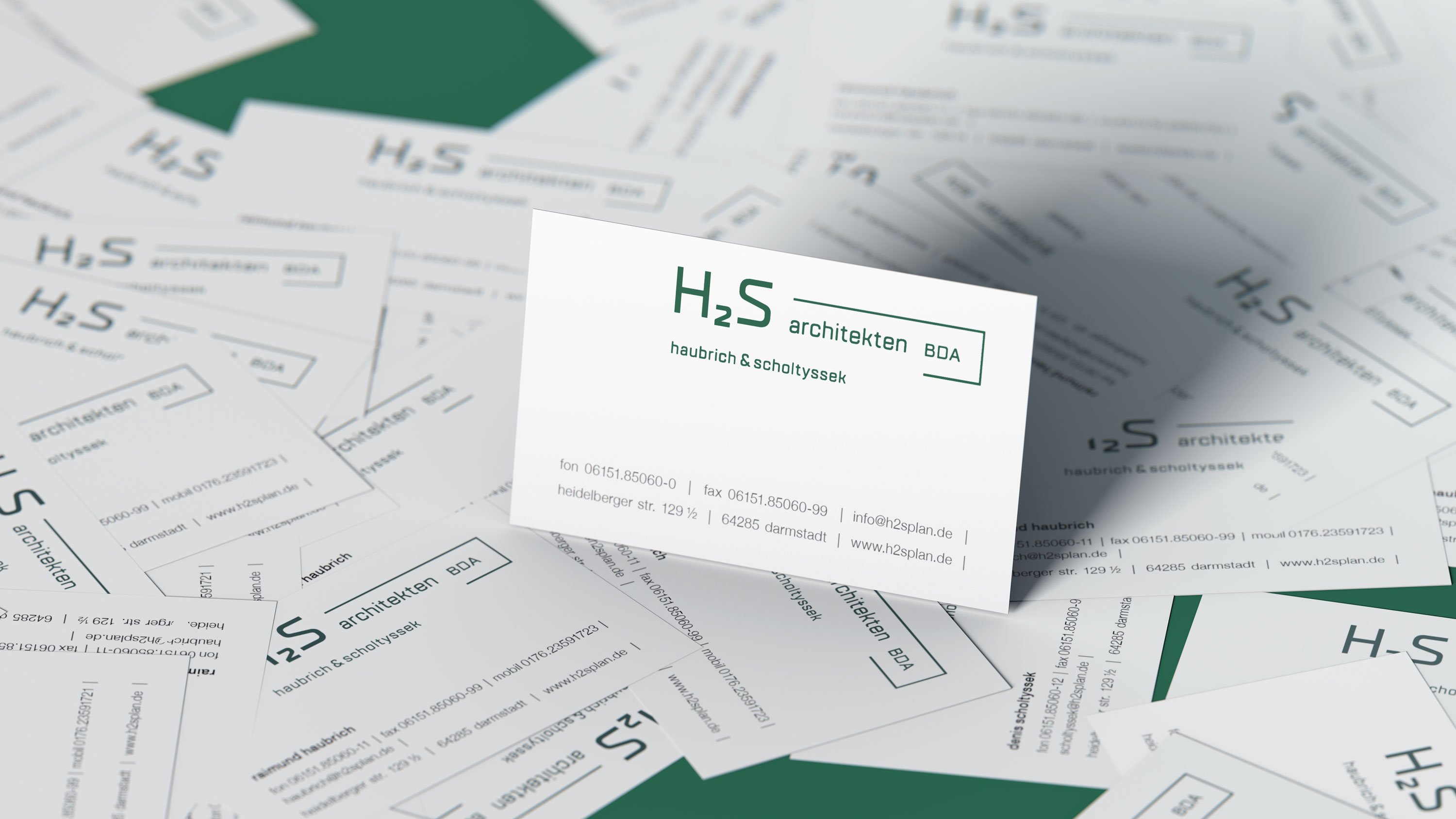
A lot of white space lets the projects take center stage on the H2S website. In the design of letterhead, business cards and DIN A4 pad for notes, DIE NEUDENKER® also deliberately opted for a reduced look in accordance with "form follows function".
DIE NEUDENKER® Services
- Corporate Design
- Logo
- Letterhead & Business Card
- A4 block
- Colour World & House Font
- Web Design
More Projects for H2S architekten


