Colours of
Measurement
Corporate Design
Design of product brochures for Gantner Instruments
Gantner Instruments provides innovative solutions for data acquisition in measurement and test engineering - worldwide. DIE NEUDENKER® designed and implemented the corporate design and the new Responsive website for the Darmstadt company. The branding also includes the new design of the product and application brochures.
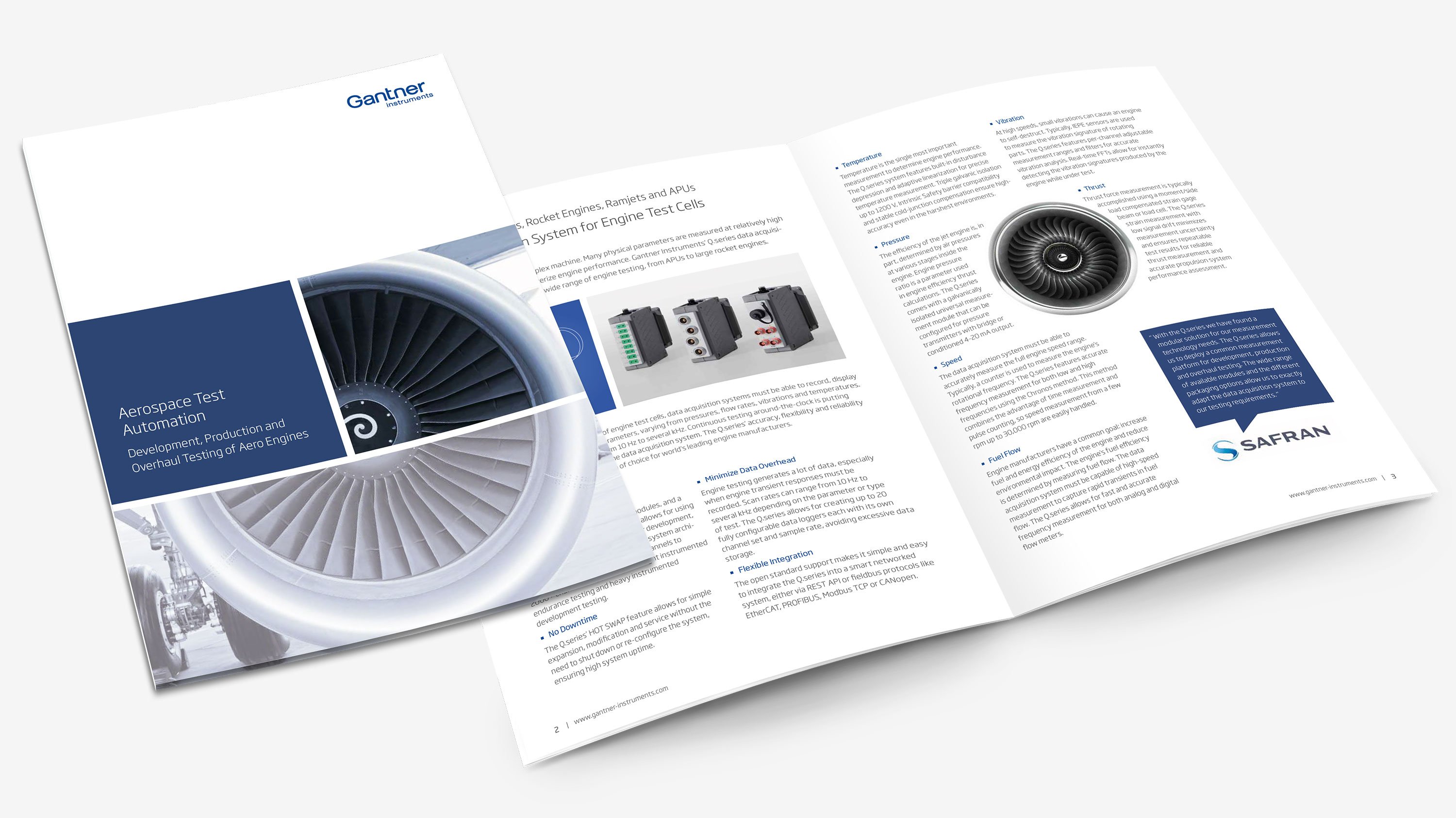
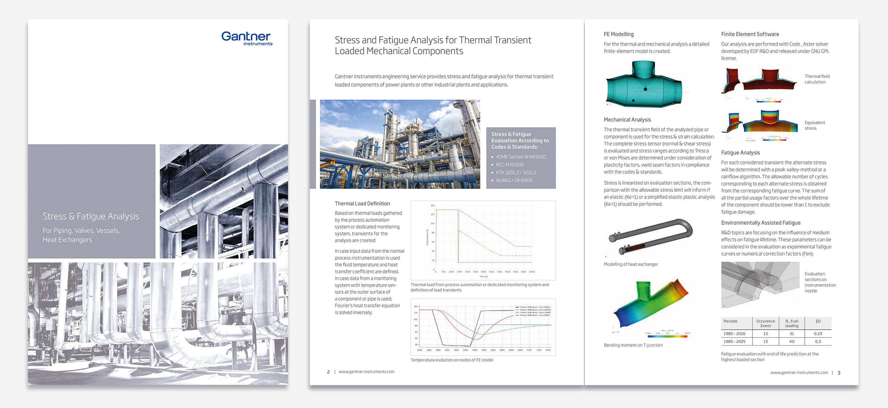
The nine brochures follow a uniform design principle. We have defined a separate colour for each application area, which is used across all media. Thus, the title is composed of a coloured square, the recurring design element, and a monochrome title motif of a metrological application. This gives the viewer orientation.
A colored stripe continues the color coding in the inner part of the booklets. The design grid is very variable and leaves enough freedom for design and arrangement of text & images. The house font Soho Gothic Standard' underlines the simple look. Cross-application products or themes, such as the module 'Q.series EC C101', are given a superordinate colour: The 'Gantner Instruments Blue' (corporate colour).
DIE NEUDENKER® also created infographics and photos for the brochures.
With the new brochures Gantner Instruments gets another building block for its appearance. This is what makes up the unmistakable personality and lived corporate communication, the corporate identity, of Gantner Instruments.
DIE NEUDENKER® Services
- Concept
- Editorial Design
- Colour World & House Font
- Illustration & Infographics


