Professional
Water Treatment
Professional
Water treatment
Corporate Website for PWT: Water as a Vocation
Whether we wash ourselves, feed ourselves, move around or gain energy - a life without water? Unimaginable!
Companies like PWT Wasser- und Abwassertechnik GmbH ensure that we are supplied with clean water every day - and that our wastewater is purified and made usable again. Because PWT plans, builds and operates water treatment plants. The Hessian general contractor's clients include industrial and public sector clients from all over the world.
After more than 50 years of company history, it was time for a fresher corporate image: DIE NEUDENKER® provided the corporate re-design as well as the website relaunch - including web design and individual programming in WordPress.
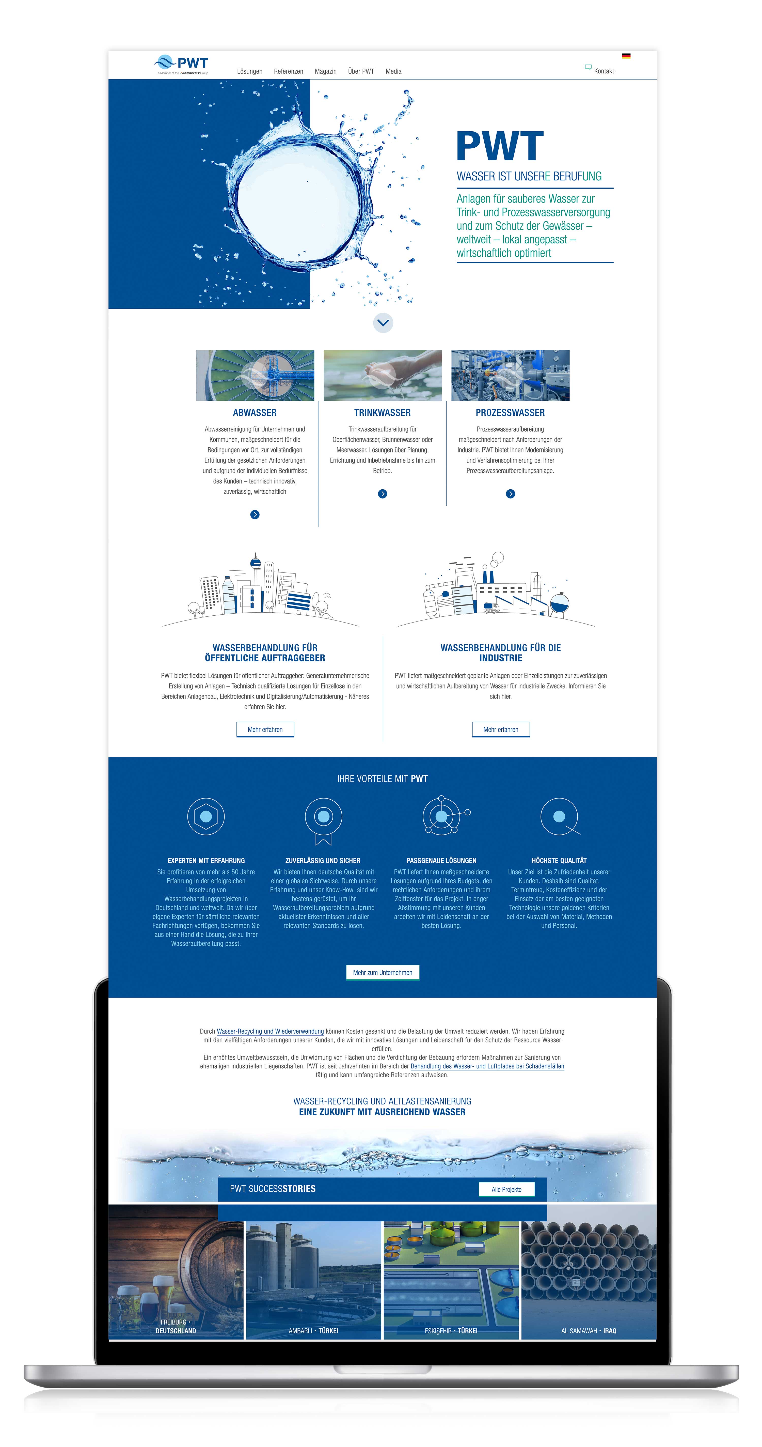
Website content: Everything about process, waste and drinking water
The wealth of information that pwt.de has to offer gives you an idea: Water treatment is a complex, demanding profession. This made it all the more important to create a website that carefully introduces the visitor to the subject - regardless of his or her previous knowledge.
The starting signal was given by our brand workshop: there we supported PWT in rethinking its brand and sharpening its brand profile. In the subsequent web and content workshop, we then jointly developed the content and structure of the new website.
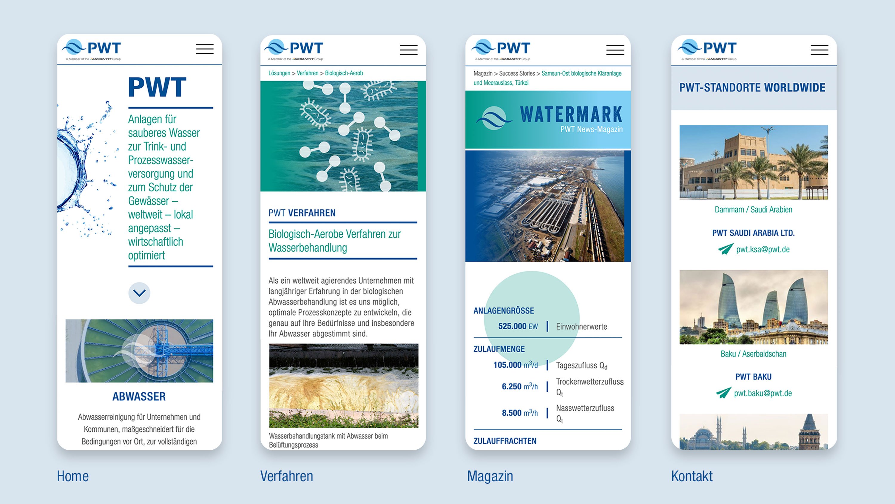
And it was worth the effort! The multilingual corporate website inspires with its clear structure and flat hierarchy, which lead the user intuitively to his goal. Especially the start page and the generous navigation menu contribute to the successful usability: While the start page offers a quick overview of the central PHE services, USPs as well as the latest reference projects, events and company news, teaser texts and preview pictures for the respective categories await the user in the menu.
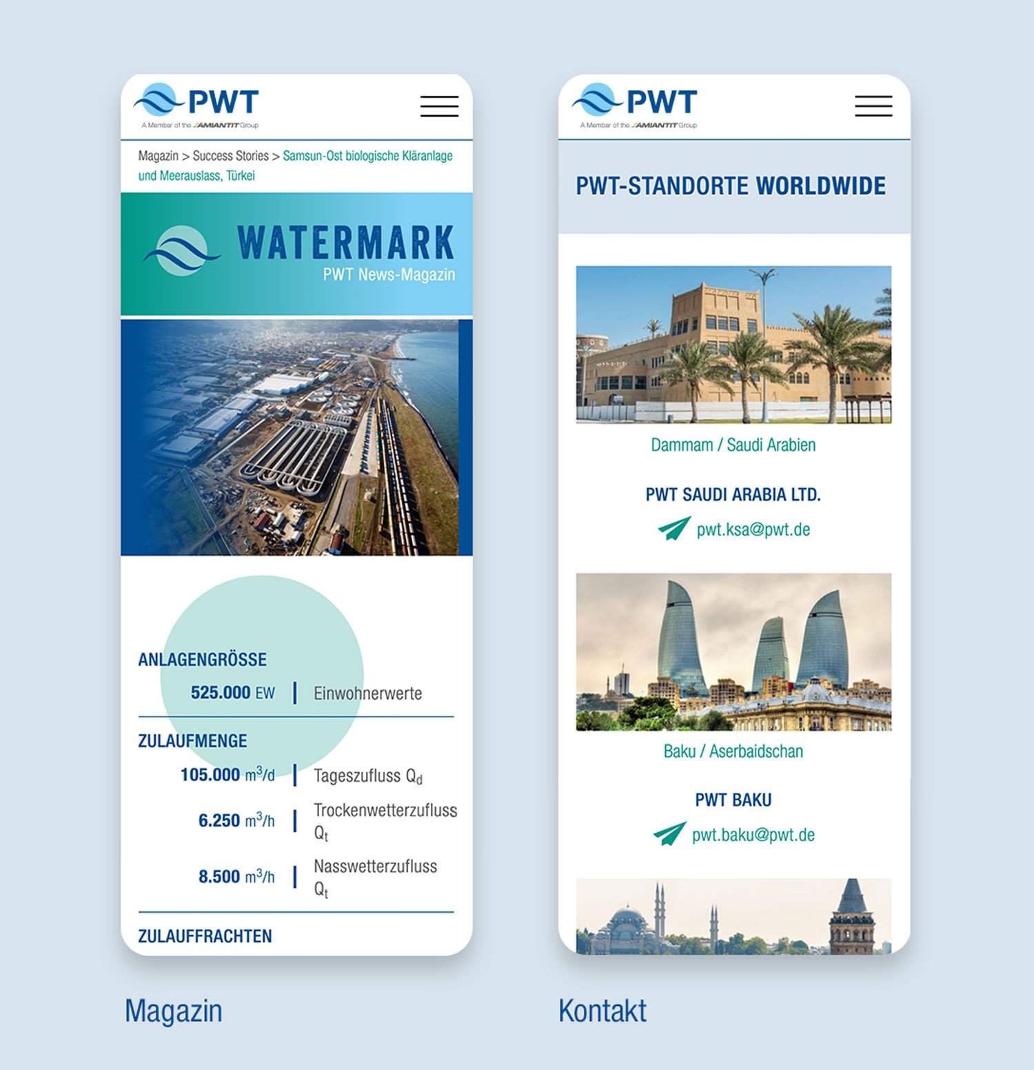
The magazine is based on an individually programmed grid. Its advantage? If a PWT editor (thanks to CMS training!) enters a new event, success story or news into WordPress, it is automatically fed into the magazine and displayed at the top of the page! The integrated filter improves the user experience additionally.
Web design and corporate design in harmony
Large-scale elements, impressive photographs and strong colour contrasts characterise the web design of the company website. The corporate colour cobalt blue stands out on the white background and directs the attention to the most important contents. It is supported by the contrasting colours emerald green and sky blue.
The corporate design gets a fresh breeze from the new corporate typeface "Neue Helvetica", the two-part typography and the individual graphic style, which can be admired in the illustrations and icons.
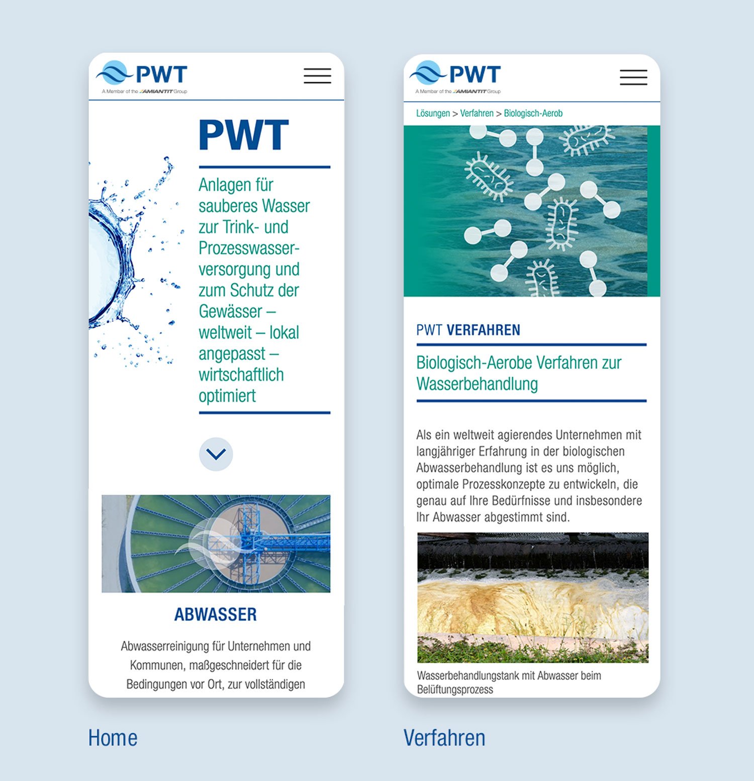
The ten-piece icon set represents the process technologies PWT uses to treat contaminated drinking, process and waste water. Placed as semi-transparent "overlays" over the headers of the process landing pages, the icons ensure a uniform look and make it easier for users to find their way around the website. By the way, the fact that this is possible on both desktop and mobile devices is thanks to our professional responsive design. 😉
DIE NEUDENKER® Services
- Corporate Design
- Workshops
- Concept and Web Design
- Individual icon design
- Individual Web Development in WordPress
- Editorial Training


